MELOPHOBIA ALBUM REDESIGN
THE BRIEF
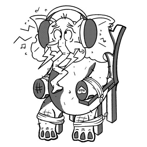
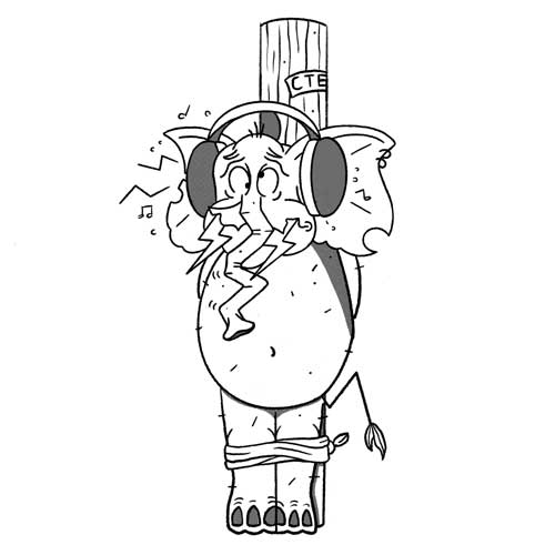
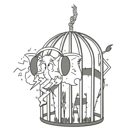
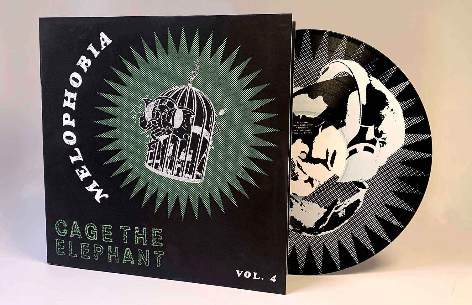
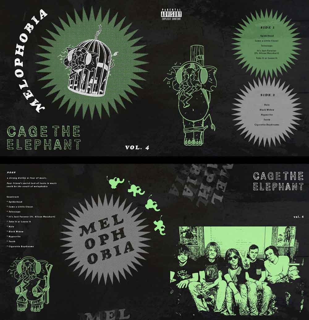
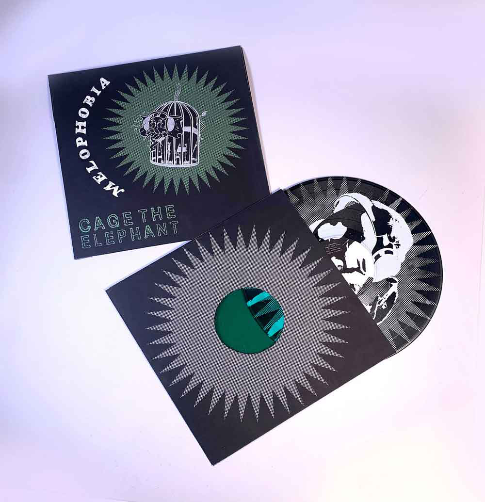
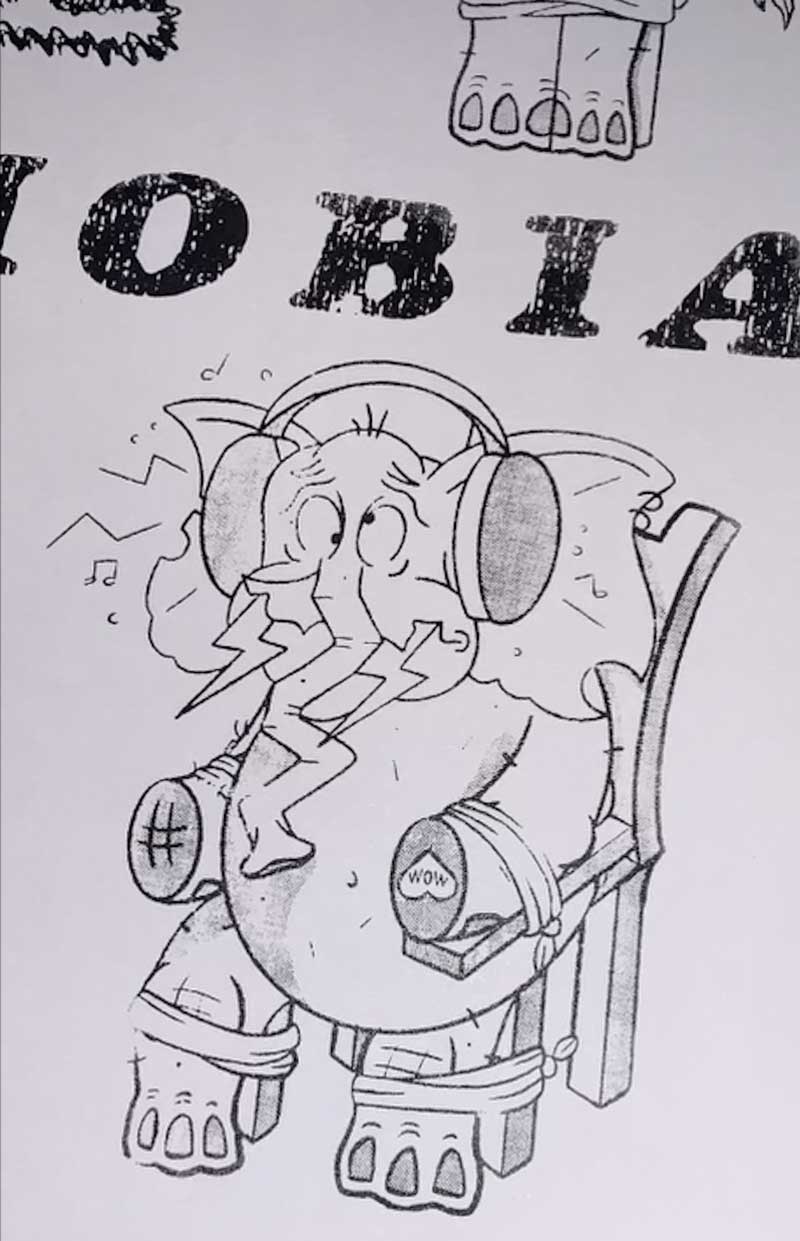
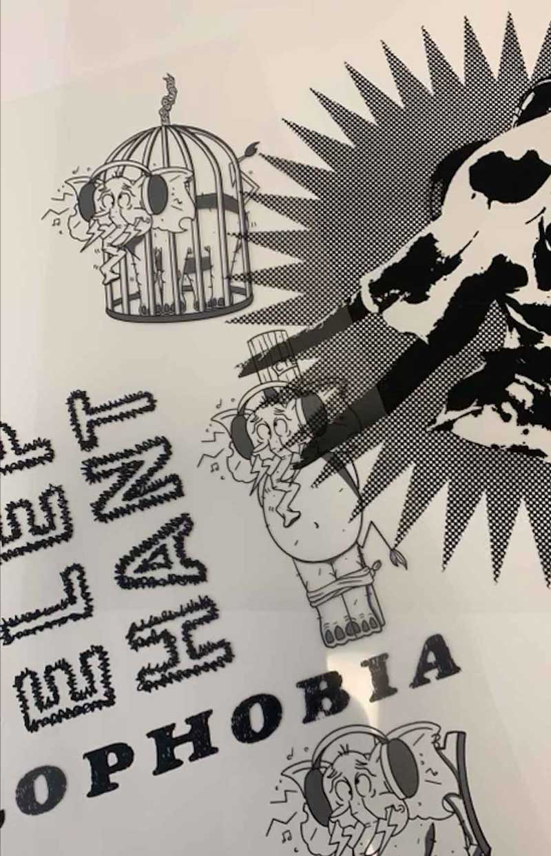
Redesign the 4th studio album by Cage the Elephant, Melophobia. Melophobia is a strong dislike, or fear, of music. Utilizing the name of both the band and the album, I designed different elements with an illustration of an elephant being forced to listen to music against its will. To reflect the band’s mystifying menagerie of colorful psychedelics, dusty blues, dingy garage, and off-kilter alternative sounds, I screen printed both the album and the record.
VISUAL TONE
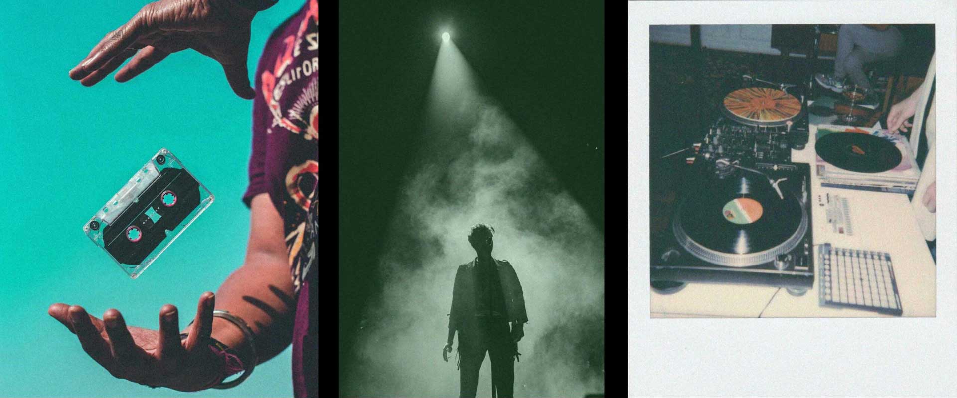
In order to establish the distinct sound and feel of the album, the goal was to focus on the band’s eclectic sound. The aim was to showcase the raw and self-made image of the band, visualizing the live performances that make fans feel alive and immersed in the music. To guide my process, I collected images that reflected the band’s image.
INSPIRATION
This album cover was envisioned to be represented by rugged and rowdy visuals. I wanted to create a rough, analog-print feel for the album, with flaky, broken ink. Old-school concert posters were referenced to achieve the desired look.
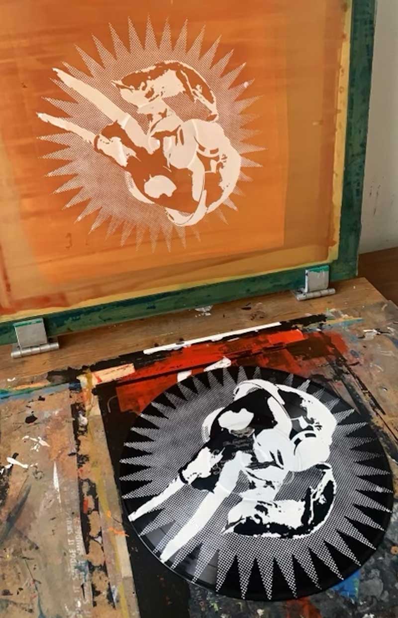
SCREEN PRINTING PROCESS
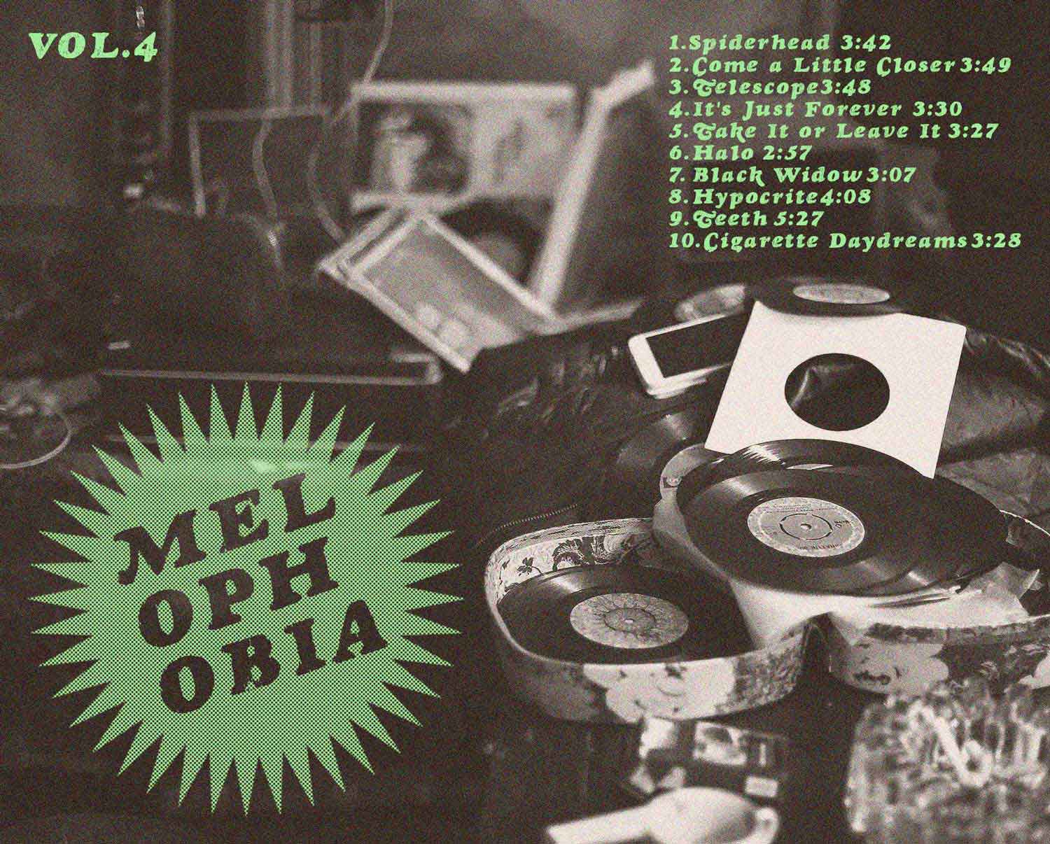
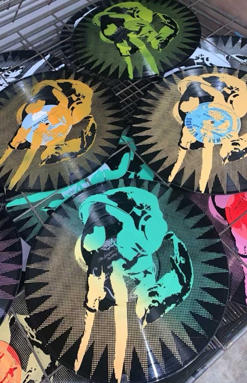
The screen printing process was critical to the creative process given that it guided me towards which colors I wanted to use for the final product, and left significant room for trial and error. Through color exploration, it gave me the opportunity to find out which colors would appear the most vibrant on a dark base. After careful consideration, I decided to stick with an electric green and white. Those colors were the most pigmented and appeared brightest on the background. I also had the opportunity to explore with gradients through screen printing. While the gradient was not used in the final product, it was a blast experimenting with the ink.
FINAL DELIVERABLES